| RQ1 | RQ2 | RQ3 |

This pivot table shows the how many people have private, public, or no account, compared to how much time they spend on social media.

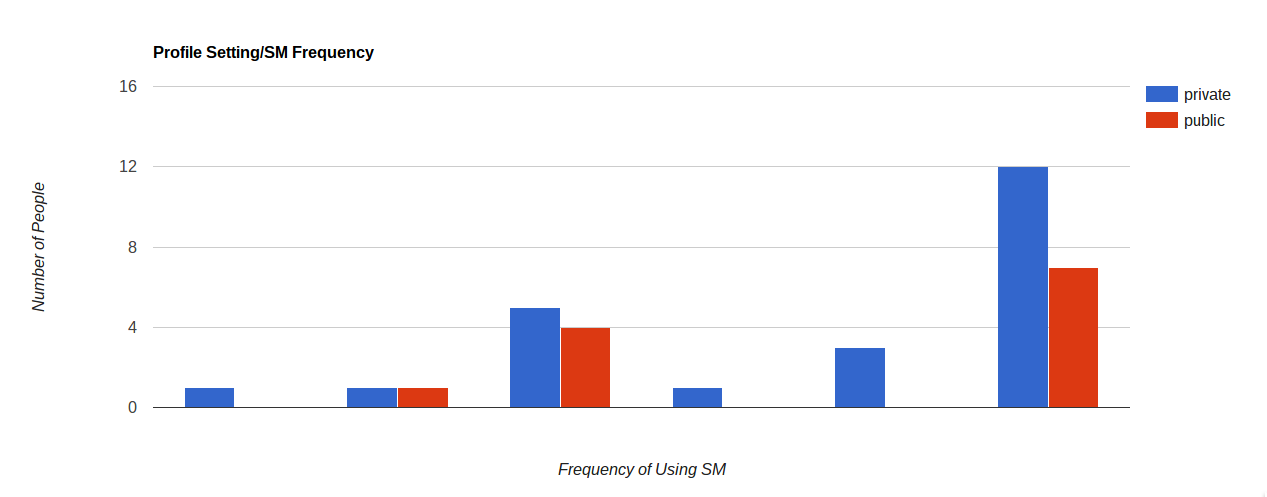
This bar chart illustrates the relationship between the number of people who use private or public accounts and how often the are on social media.

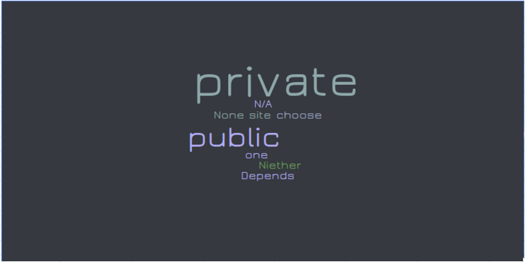
This word count sorts how many times each word (type of account) is used by people who took the survey.

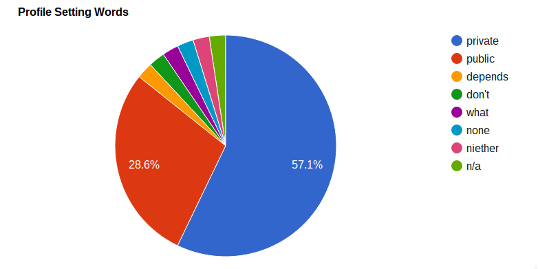
This pie chart illustrates the number of different types of accounts that were stated compared as a whole.
The charts show that the number of people who have private setting is always more than number of people who have pulbic settings.
Some groups show similar number of people in each of the settings but the number is not big enough to be significant.
There wasn't enough data in our two classes to be able to find any correlation, maybe if we had bigger data, we would be able to form a better conclusion.
In conclusion, there is no correlation between how frequence using social media and profile setting.